Creating the vertical header using the Beaver Builder plugin in Astra theme. In this tutorial I am showing how you will achieve this with our popular two tools: Beaver Builder plugin and Astra theme.
At first we remove the global header from entire site. I have not Astra Pro. So I did this. It will entirely remove the site header from your Astra site.
Now we shall create a template with Beaver Builder plugin.
- Login to Dashboard
- Navigate to Builder -> Templates page
- Click on Add New button
- Drag&Drop the one column row
- Resize the row width. I set into 340px
- Add the modules. I used Heading, Separator Menu & Icon Group
- Click on Row Settings Wrench Icon and add “vertical-header” CSS class name under Advanced tab
- Publish the template
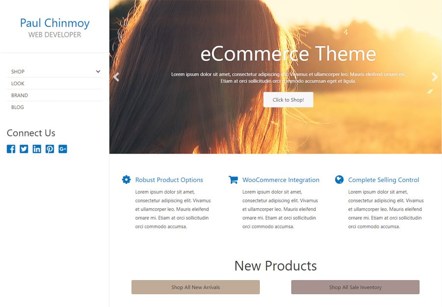
Template will be look like this (see the attached image) :

Afterthat we add this Beaver Builder template on our site and use it as vertical header bar. Open the functions.php file of your astra child theme and add this PHP snippet at end of the file:
add_action('astra_header_before', 'vertical_header', 1);
function vertical_header() {
	echo do_shortcode('');
}
[fl_builder_insert_layout] is a Beaver Builder shortcode which is inserting the Beaver Builder template into your site. We are using it when we are putting the template in a PHP file.
110 is my template ID. You will replace it with your own template ID or you can use the slug instead of the ID.
This is the final step. We need some CSS to put this template at left side. Open your style.css file of you astra child theme and add this CSS
.vertical-header {
	border-right: 1px solid #ede3e3;
	display: block;
	height: 100%;
	padding-top: 40px;
	position: fixed;
	top: 0;
	left: 0;
	width: 340px;
	z-index: 99;
}

.site-content,
footer {
	margin-left: 340px;
}
Now refresh the home page and you will get the vertical header bar at left side.
Note: I did not make the mobile responsive effect. You can easily do it with Beaver Builder. Create another new template for Medium and Small device and place this template via shortcode.
Hi, can you use this menu even if your website is built with Elementor?
Also, can you make it off-canvas easily?
Thanks
I was searching for a way to implement the header on left for one of our client sites when I found this post. We ended up implementing this in another way which I want to share here as it might be useful for others.
A simpler non-page builder way of this can be done using a left sidebar. You can just create a left sidebar in Customizer, put the logo, menu items and other stuff in widgets and then disable the header.
Great tutorial, keep up the hard work.